Plotting the Results
In this section, we will outline various plotting options of MDANSE.
There are two tabs in the GUI which deal with data plotting. “Plot Creator” is used for loading the data files and selecting the specific data sets to be plotted, and is shown in Fig. 17.
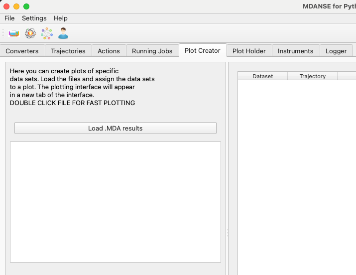
Fig. 17 At first, the plot creator does not contain any data files.
“Plot Holder” stores individual plots in separate tabs. The currently selected plot tab is the one that will receive new data sets. The “Plot Data” button in the Plot Creator sends the currently selected data sets to the current plot in the Plot Holder.
Every time you perform an action in the Plot Creator tab that has an effect on the contents of the Plot Holder, the Plot Holder tab will be highlighted in the GUI (see Fig. 18).
Loading the Results
The MDANSE GUI can load the .mda files, which are the output of different analysis types. When you load the files in the Plot Creator tab, they will appear in the tree view on the left.
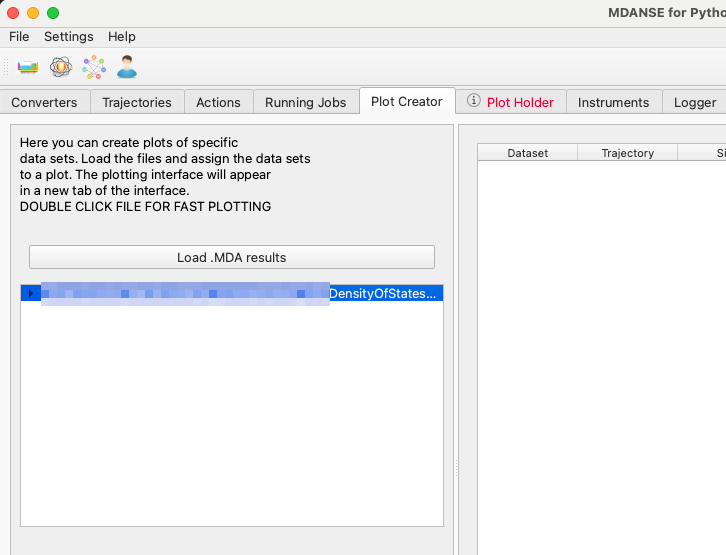
Fig. 18 Plot Holder is highlighted, since a new plot has been created.
Viewing the Results
Quick Plot
Once a file has been loaded into the Plot Creator tab, a quick plot can be created by double-clicking a entry. All new plots will appear in the next GUI tab, called “Plot Holder”.
Double-clicking a single dataset will create a new plot of this dataset in the Plot Holder tab. Double-clicking a data group will create a plot of all the datasets directly in the group (but not recursively in other groups inside this one.)
Finally, double-clicking a file name will create a plot of the main results contained inside the file. For each analysis type, MDANSE marks several datasets as “main” results and as “partial” results. The datasets with the tag “main” will be shown in a quick plot, and those with the tag “partial” will additionally be set to the dashed line style.
If you need to combine different datasets in a single plot, especially datasets originating from different files, you will have to select the plot contents manually.
Manual Plotting
Selecting the datasets manually is slower, but offers greater control over the contents of the plot. In this approach, datasets from several files can be put in a single plot, allowing them to be compared directly.
In Plot Creator, you can unfold the tree view of a data file. All the data sets will be listed there, and clicking any of them will add them to the list of data sets to be plotted.
Typically, you will want to use the “New Plot” button first to create an empty plot. The Plot Holder will automatically make the new plot the active one, so you can just click “Plot Data” afterwards to send your selected data sets to the new plot.
Once you have switched to the Plot Holder tab, you can further customise the specific plots.
Data as Text
You can view the data as numbers in the plotting interface by creating a “New Data View (Text)” instead of a “New Plot”. This will create a tab in the Plot Holder which visualises data as text. You can send data sets to that text view the same way as to a plot, by clicking “Plot Data”.
The text view will recalculate the data axes according to the currently selected physical units, the same as it is done in plots. It can also be used for saving the data to a text file, in CSV format.
Plot types
Single
All the data sets will be shown on a single set of axes (see Fig. 19). This is useful for comparing similar data sets. Sliders under the plot can be used to add offsets between curves, which can be applied to check if some of the curves are overlapping in the plot.
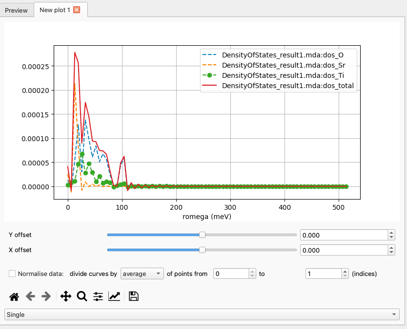
Fig. 19 Density of States results as a “Single” plot.
Grid
Each data set is plotted on its own axes (see Fig. 20). Sliders are not used in this plotting mode.
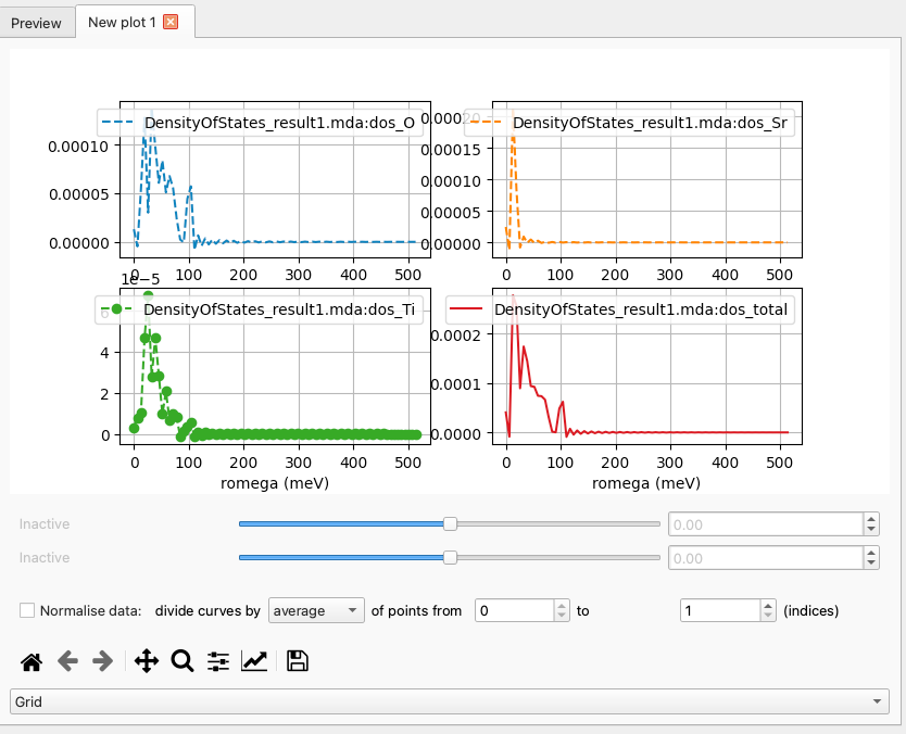
Fig. 20 Density of States results as a “Grid” plot.
Heatmap
A 2D heat map (Fig. 21) plot can be used for 2D and 3D data sets. The sliders can adjust the maximum and minimum values on the colour bar.
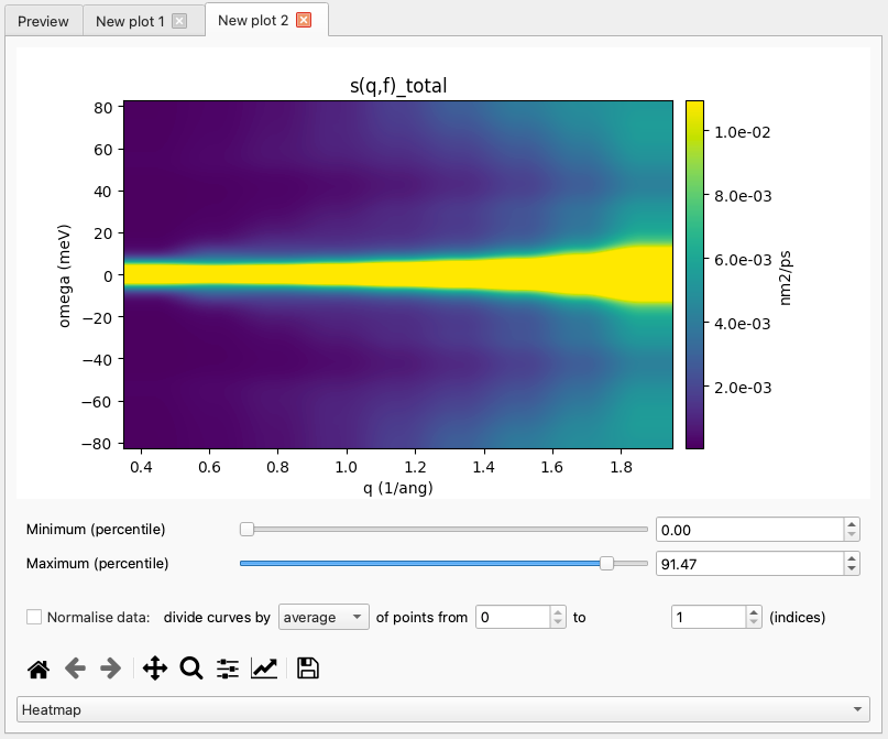
Fig. 21 Dynamic Coherent Structure Factor of water as a “Heatmap” plot.
The orientation of a 2D array can be changed by specifying a different main axis of the plot (Fig. 22).
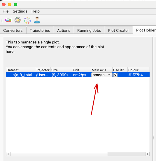
Fig. 22 The axis chosen here will become the x axis of the plot.
Changing the main axis will result in an updated plot (Fig. 23).
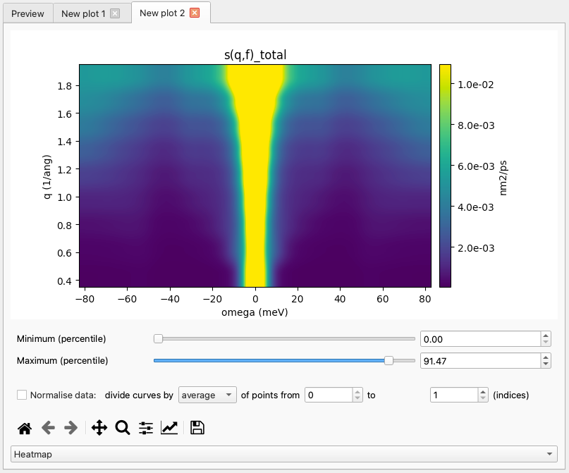
Fig. 23 The same 2D array is now plotted against the energy axis.
Saving the Data
Basic saving
It is possible to save the data as they are presented (including
modifications, shifts and normalisations) to file for further
processing. These data are saved in an annotated .csv format for
transferability and ease of use.
Each data block (axis, line) starts with a commented header-line
(using # as a comment marker) detailing the contents of the block.
Note
Because of potentially mismatched axes (e.g. due to numerical rounding) it is not possible to stack multiple lines side-by-side in the output data file.
Advanced saving
If you do not wish to save all multi-plot data to the same file, it is possible to use some magic strings in the filename to dump each axis or line to its own file.
These strings are %axis%, %line%. If these are present in the
filename, the data will be split into multiple files with %axis%
and %line% replaced with the respective axis or line index.
Customising the Plot
Matplotlib settings
Analysis results are plotted using the matplotlib library. It offers many options of customising the plots, including some like the figure dimensions and DPI value which have to be set before a new plot is created.
MDANSE saves the matplotlib parameters in its own configuration file, and offers a simple interface for modifying the settings. Plot Creator tab includes a button for accessing the plot settings (Fig. 24).
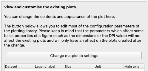
Fig. 24 This button (“Change matplotlib settings”) opens the plot settings dialog.
For each configuration entry, both the current value and the default value are shown. Changes to the current values are applied immediately, and should affect the existing plots wherever possible. The configuration dialog is shown in Fig. 25. Here, the filter field has been used to find the entries containing the word “figure”, and the user has changed the figure DPI value from 100 to 300.
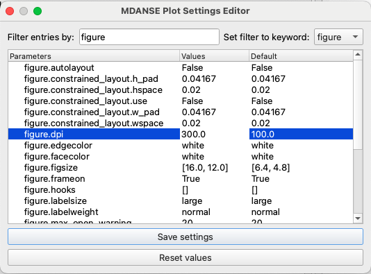
Fig. 25 This change will affect only the new plots and not the existing ones.
If the changes introduced here should become permanent, it is possible to save them using the “save settings” button. They will be stored in MDANSE configuration and loaded automatically next time MDANSE_GUI is started. To completely undo all the changes, you can use the other button, “reset values”, which sets all the parameters back to the matplotlib default values.
Global settings
Global settings of the plotter affect the appearance of the plots and the preferred physical units used for plotting. They can be changed in the Plot Holder using the part of the GUI in Fig. 26.
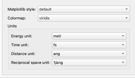
Fig. 26 These settings will be applied to all plots.
Plot-specific settings
The side panel of the Plot Holder (Fig. 27) contains the settings affecting the appearance of the individual curves. Specifically:
the “Legend label” is the text that will be used for this curve in the plot legend,
the “Use it?” checkbox can be unchecked to remove a curve from the plot; the text input field next to it can be used to select a subset of 1D curves from a 2D or 3D dataset.
the “Marker” field changes the point marker used for a data set,
the “Line style” field changes between solid, dashed and dotted lines,
the “Colour” field can change the colour of a curve,
the “Apply weights” checkbox can be unchecked to remove the scaling factor applied according to the weights scheme (See also Weighting Scheme).
Currently, the line style, marker and colour settings are ignored for 2D arrays. As there is only one table entry per data set, setting all the curves from a 2D data set to a single colour, style or marker type would make it difficult to distinguish between specific curves.
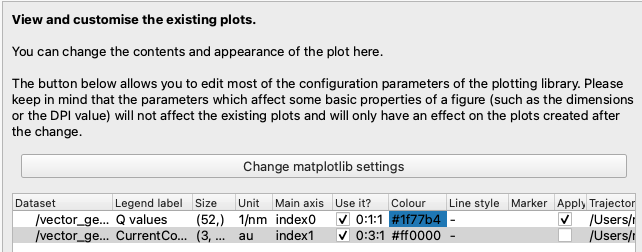
Fig. 27 These settings will automatically update the plot when changed.
Additionally, the plots in MDANSE are created using matplotlib, and the can use the standard matplotlib toolbar to switch the plot axes to logarithmic scale.
Slicing a 2D array
You can use a subset of curves from a single data set by specifying their array indices in the “Use it?” field. Examples in Fig. 28 and Fig. 29 show how to select a single curve, or several curves separated by a fixed step, respectively.
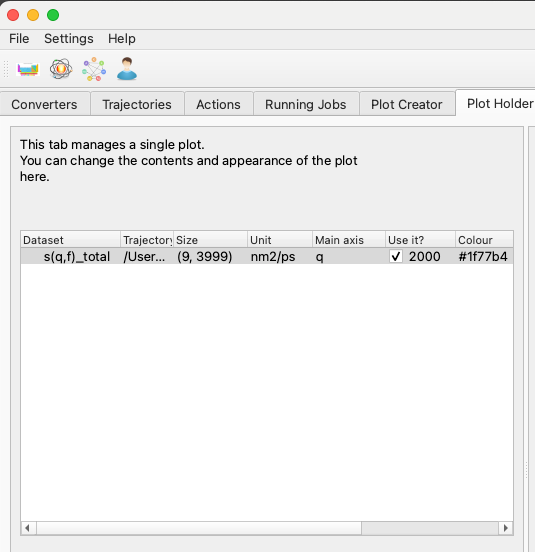
Fig. 28 A single 1D curve will be plotted.
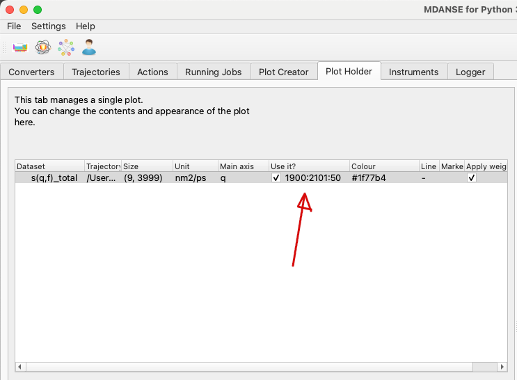
Fig. 29 Five 1D curves will be plotted. The numbers in the “Use it?” field are in the “first:last:step” format.
While the curves are selected based on their index in the 2D array, the plot legend will contain information about their position on the physical axes of the data set, as shown in Fig. 30.
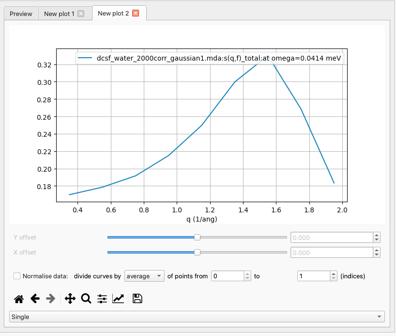
Fig. 30 The legend of the plot shows which part of the 2D data set is represented by this curve.